Imagine These
Interior Design
Wednesday, October 28, 2020
Corporate Office Interior Design Idea | GUATEMALA.COM OFFICES | Guatemala City | ACA
A collaborative workspace invaded by three main elements: concrete, solid colors, and lots of natural light.
Concrete plays an important role in shaping the envelope of the place, the vibrant and solid colors become the main occupants of the space, and the large windows give us a constant bath of light and energy.
Another important element that is present is the white on the walls, which in addition to being the color of balance, acts as a canvas to display works of art by new artists in the country......more
Tuesday, October 27, 2020
Student Accommodation Facility Interior Design | Bloomsbury | London | 74
The brief was to create a series of differentiated, but interlinking spaces, for students to gather and socialise, but also to study and have quiet time. The range of spaces included a lower-ground gym, a ground floor reception (with back-of-house offices for staff), a study area, games zone and teapoint, with private dining and TV lounge on the 5th floor. The design needed to reference the building’s context as well as iQ’s corporate signature colours......more
Monday, October 26, 2020
Restaurant Interior Design Idea | Banu Restaurant | Zhengzhou China. | Link Arc
The Banu Restaurant design includes the interiors and façade replacement for a 2100sm building in Zhengzhou China. As the Flagship restaurant for a growing and innovative franchise it was important for the client that the project creates a recognizable landmark along the main axis road and be welcoming to the community.
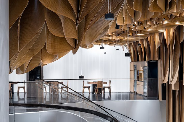
Our design sought to honor Banu, the river man’s history, but creating a space formed from a natural yet turbulent flow and marked by the sinuous lines of the rope pull lattices. We first break down the large scale, and orthogonal structural grid of the existing building and reframe the space into a fluid organization system with a series of sculptural cones shaped for private dining and open kitchens. Then, two vertical conical voids are introduced at the lobby and the main seating area to tie two dining levels together. The third strategy involved the design of an organic lattice ceiling that varied in. Through varying the density, height, and size, the ceiling panels we were able to transform the transparency, creating a sense of depth to space as you move through.
The ideas of the interior were extended to exterior facade. The façade is pulled up at the entry and connects along with the ceiling giving continuity between the exterior and interior envelopes. Through the unity of interior and exterior, the effect is a constantly changing dynamic to the street where the public is welcome to view and join in the activities of the restaurant........more
Labels:
Link Arc,
Restaurant
Subscribe to:
Comments (Atom)


